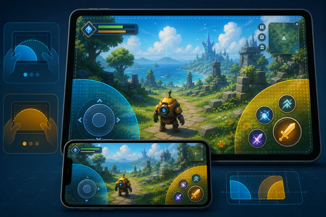
Touch controls are not a smaller copy of a keyboard layout. They must fit real hands, survive changing screen sizes, and communicate state without covering the action. A good control layer feels immediate, remains readable during fast play, and gives players enough freedom to adapt it to their grip.
Map game actions before drawing buttons
List every action and classify it as continuous, repeated, or occasional. Movement and camera input need persistent zones. Jump, attack, dash, and interact usually need discrete buttons. Pause, inventory, and settings can sit farther from the primary thumb arcs. This prevents a crowded overlay and keeps the most important actions reachable.
Keep touch, keyboard, and gamepad inputs behind one semantic action layer. The game should receive actions such as moveLeft or jump, not device-specific events. That makes rebinding and cross-device testing much simpler. The same architecture supports the advice in our HTML5 gamepad support guide and keyboard remapping guide.
Design for thumb reach
For landscape games, reserve the lower-left region for movement and the lower-right region for primary actions. Keep critical buttons inside comfortable thumb arcs instead of pushing them into corners. Avoid placing actions beneath browser gestures or system navigation areas. Portrait games often work better with a compact lower control shelf and a playfield that stays visually clear.
Buttons need generous targets and visible separation. The visual circle may be smaller than its hit area, but neighboring hit areas must not overlap. Give dangerous or irreversible actions more distance from frequently tapped controls. Test with both hands, one hand, and a device held in a case.
Respect safe areas and responsive layouts
Use CSS environment variables such as env(safe-area-inset-bottom) and env(safe-area-inset-left) when positioning controls. Anchor zones relative to the viewport and game canvas, then clamp their size so they do not become tiny on narrow phones or huge on tablets. Recalculate layout after orientation changes, resize events, and fullscreen transitions.
The canvas should not determine control size by simple scaling alone. Use a responsive overlay with CSS pixels, a minimum target size, and spacing rules. If your menus also adapt across devices, the techniques in our responsive pause-menu guide are a useful companion.
Build a predictable virtual joystick
A fixed joystick is easy to learn because its center never moves. A floating joystick reduces reach because it appears where the player first touches within a movement zone. Whichever model you choose, define a small dead zone, clamp the knob to a maximum radius, and normalize the resulting vector before sending it to gameplay.
Do not wait for the finger to return exactly to the center. Movement must reset when the pointer is released, cancelled, leaves the valid interaction, or the page loses focus. A stuck movement vector is one of the most damaging mobile-control failures.
Handle multi-touch and cancellation correctly
Use Pointer Events where supported and track each active pointer by its identifier. Capture the pointer after a control begins so movement remains stable when the finger slides beyond the visible button. Always handle pointerup, pointercancel, visibility changes, and orientation transitions. Clear every active action when the game pauses or loses focus.
Mark the control surface with an appropriate touch-action policy so browser scrolling and zoom gestures do not steal gameplay input. Apply that restriction only to the game control region, not to normal article, menu, or settings content.
Make feedback immediate but restrained
Pressed controls should change state immediately through scale, brightness, fill, or a short animation. Optional vibration can confirm important actions, but it should be brief and respect platform availability and player preferences. Audio feedback is helpful in menus but may be distracting for rapid gameplay buttons.
Do not rely on color alone. Shape, icon, position, and motion should reinforce state. Maintain readable contrast over both bright and dark scenes, and preserve label clarity using the principles in our game text-scaling guide.
Offer accessibility and customization
Let players adjust control size, opacity, spacing, and, when practical, position. A left-handed preset can swap movement and action groups. Toggle options are useful for actions that otherwise require a long hold. Provide a reset button so experimentation is safe.
Controls also need accessible names for assistive technology when they are implemented as DOM elements. If the canvas is the only interactive surface, provide an equivalent settings path and clear instructions outside it. Avoid requiring multi-finger gestures for essential actions unless an alternative exists.
Protect performance
Process input at the game-loop boundary and store compact state rather than triggering layout work on every pointer move. Update joystick visuals with transforms, avoid synchronous geometry reads during movement, and limit expensive effects such as large blurs. Input latency is more noticeable than decorative polish.
Test a real device matrix
- Small and large phones in portrait and landscape.
- Devices with notches, rounded corners, and gesture navigation.
- 60 Hz and high-refresh displays.
- One, two, and several simultaneous touches.
- Orientation changes while fingers are down.
- Fullscreen entry, exit, backgrounding, and return.
- Slow hardware under representative rendering load.
Remote emulation helps with layout, but it cannot reproduce grip, thumb reach, glass friction, or accidental palm contact. Use real-device play sessions early. For a broader mobile delivery checklist, see how to optimize HTML5 games for mobile.
Common mistakes
- Shrinking a desktop HUD without redesigning reach zones.
- Using one touch listener without tracking pointer identity.
- Failing to clear input after cancellation or focus loss.
- Placing controls inside safe-area or browser-gesture regions.
- Making hit areas identical to small visual icons.
- Covering threats, objectives, or important status information.
- Skipping customization and left-handed layouts.
Launch checklist
- Map each action to a shared input abstraction.
- Separate movement and action zones by thumb reach.
- Add safe-area padding and responsive size limits.
- Handle pointer capture, cancellation, and focus loss.
- Provide clear pressed-state feedback.
- Offer size, opacity, and handedness options.
- Measure latency and frame pacing on real devices.
Touch-friendly controls are a gameplay system, not a decorative overlay. When layout, input semantics, feedback, accessibility, and device testing are designed together, mobile players can focus on the game instead of fighting the interface.