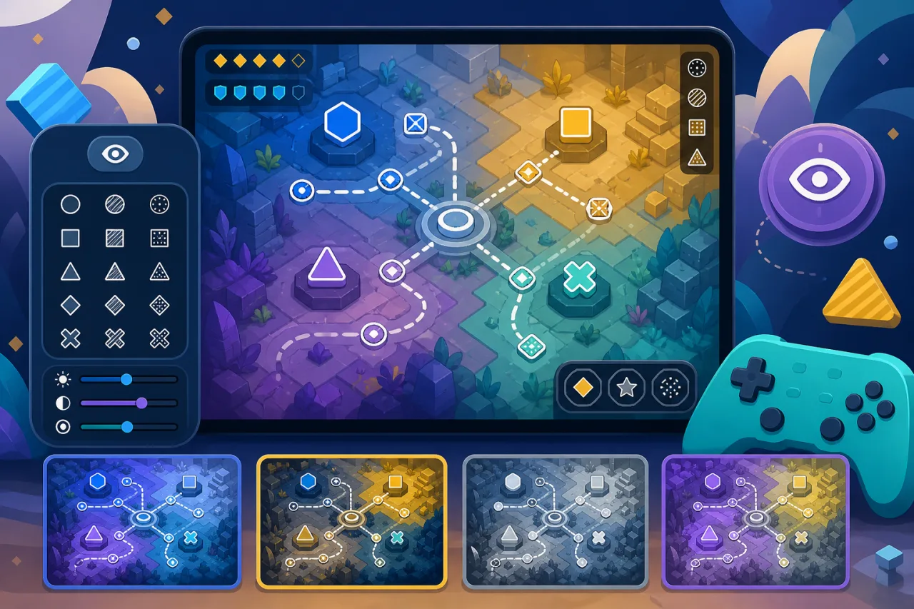
Color is a powerful part of game design, but it should never be the only way a player can understand danger, teams, rarity, objectives, or status. A colorblind-friendly mode combines safer palettes with shapes, patterns, labels, and luminance differences so critical information remains clear. This guide shows how to design, implement, and test that feature in an HTML5 game.
Start with gameplay information, not a filter
A global color filter can change the look of a scene, but it cannot repair information that was encoded only as red versus green. Begin by listing every decision that depends on color: enemy and ally outlines, health states, puzzle pieces, map markers, damage types, loot rarity, warning zones, rhythm prompts, charts, and multiplayer teams.
Rank those elements by consequence. Missing a decorative accent is different from confusing a safe tile with a hazard. Fix the highest-impact signals first and make their alternatives visible during real play, not only in a settings preview.
Never rely on color alone
Give important states a second channel. Use distinct silhouettes, icons, line styles, textures, motion patterns, labels, or sound cues. A locked door can use a lock icon, a poisoned status can use a unique symbol, and team markers can combine palette changes with shapes or letters.
The same rule applies to UI controls. The selected option should have a checkmark or border treatment, not only a different fill color. This approach also supports players on poor displays, in bright light, or with reduced color accuracy.
Define a small set of purposeful modes
Offer a default palette plus a few clearly named alternatives designed around common color-confusion patterns. Avoid presenting dozens of unexplained swatches. Each mode should specify replacements for semantic roles such as friendly, hostile, warning, success, selection, and neutral.
Store roles in a central theme object instead of hard-coding colors throughout the game. When the player changes mode, update the theme once and redraw dependent assets. Keep the underlying meaning stable: the same semantic role should use the same replacement across the HUD, map, menus, and effects.
Use luminance, shape, and pattern together
Two colors may look different in a design tool yet have similar brightness during gameplay. Check important pairs in grayscale to see whether their luminance is distinct. For adjacent areas, add borders, hatching, dots, stripes, or unique silhouettes.
Patterns should remain legible at the size used in the game. A detailed texture that works in a large mockup may turn into noise on a small mobile screen. Use simple, high-contrast motifs and test them while the scene is moving.
Build an immediate settings preview
Place the option under Accessibility or Display and apply changes instantly. The preview should show actual game elements: team markers, a warning zone, a health state, a map icon, and a rarity badge. Let the player compare modes without starting a new level.
Coordinate the palette with other readability controls. The guidance in How to Add High-Contrast Visual Settings to HTML5 Games helps preserve contrast, while Text Scaling and Readability Settings for HTML5 Games keeps labels legible when they accompany color-coded elements.
Implement theme roles in canvas games
For a canvas renderer, keep accessible colors and pattern definitions in a shared configuration. Resolve a semantic role at draw time rather than storing raw color values on every object. When the setting changes, invalidate cached sprites or render targets that contain palette-dependent pixels.
If important colors are baked into artwork, prepare alternate assets or use masks that can be recolored predictably. Do not apply a full-screen shader and assume the task is complete; icons, particles, UI overlays, and pre-rendered images may still carry ambiguous pairs.
Keep DOM overlays and CSS in sync
HTML menus and canvas gameplay should use the same semantic theme. CSS custom properties work well for DOM elements, while the JavaScript renderer can read from the corresponding theme object. Test focus rings, disabled states, validation messages, and charts in every mode.
When icons include meaning, provide accessible names for screen readers and keep navigation understandable without visual color cues. The patterns in Screen Reader-Friendly Menus for HTML5 Games can help make the settings interface itself easier to use.
Save the preference and apply it early
Persist the selected mode in local storage or the player's account profile. Validate the stored value against a fixed list of supported themes. Apply it before the first menu or loading screen renders so the interface does not flash from the default palette to the chosen one.
Provide a Reset to Default action and never hide the option after onboarding. Players may change displays, share devices, or discover the feature later.
Test in real gameplay conditions
Color-vision simulators are useful for finding risky combinations, but they do not replace testing with players. Review screenshots and video from representative levels, then play through fast combat, puzzles, low-light scenes, menus, and multiplayer situations in every mode.
- Verify that friends and enemies remain distinct while moving.
- Check hazards against every common background.
- Confirm that patterns survive scaling and animation.
- Test maps, minimaps, charts, and results screens.
- Review particle effects, outlines, and temporary status indicators.
- Use different monitors and mobile screens at low brightness.
- Include long sessions so visual fatigue can be reported.
Also verify keyboard and controller navigation after adding the setting. A mode is not useful if the player cannot reach it; see How to Add Keyboard Remapping to HTML5 Games for related input accessibility.
Watch for common mistakes
- Changing only the HUD while leaving gameplay objects ambiguous.
- Using a global filter as the entire solution.
- Renaming modes with medical claims the design has not validated.
- Choosing palettes without checking luminance and background contrast.
- Using tiny or overly detailed patterns.
- Forgetting particle effects, tutorial images, or minimap icons.
- Resetting the preference on every visit.
- Testing screenshots but not motion and time pressure.
A practical implementation checklist
- Inventory every gameplay decision currently communicated by color.
- Define semantic roles and a small set of tested palettes.
- Add icons, shapes, borders, labels, or patterns to critical states.
- Centralize theme values for both canvas and DOM interfaces.
- Create an immediate preview and persist the preference.
- Update cached art and effects when the mode changes.
- Test every level type, screen size, and input method.
- Invite players with varied color vision to review real gameplay.
A strong colorblind-friendly mode does more than recolor the screen. It makes the game's visual language redundant and dependable, so players can read important states through multiple cues. Build around semantic roles, reinforce color with shape and pattern, and test the result during actual play.