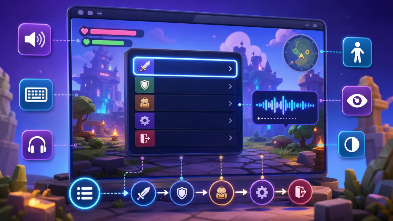
Most HTML5 game menus are designed for sight and pointer input first. That can leave screen-reader users with an unlabeled canvas, an unpredictable focus order, or controls that announce nothing useful. The solution is not to narrate every animation. It is to expose a clear, semantic menu structure that mirrors the actions players can take.
This guide explains a practical DOM-based pattern for accessible menus, focus management, announcements, testing, and progressive enhancement without disrupting the visual game interface.
Why canvas-only menus are difficult for screen readers
A canvas is a bitmap from the browser’s perspective. Buttons, headings, sliders, and selected states drawn inside it do not automatically become accessibility objects. A screen reader may encounter one unlabeled canvas element instead of a usable menu.
Keep the visual menu in the game if that fits your design, but pair it with semantic HTML controls. The DOM layer becomes the accessible interface while both layers call the same game actions.
Start with a shared menu model
Define menu items as data rather than hard-coding separate visual and accessible versions. Each item should include a stable identifier, a concise label, its current availability, and the action it triggers. Render that model into the canvas or game UI and into an HTML menu placed alongside it.
Use native buttons whenever possible. They already support keyboard activation, focus, and familiar announcements. Avoid making generic div elements behave like buttons unless there is no reasonable alternative.
Give every screen a useful structure
- Use one clear heading that names the current menu.
- Group related controls with
fieldsetandlegendwhen appropriate. - Label sliders and switches with their purpose and current value.
- Expose disabled actions with the native
disabledstate. - Keep labels short and action-oriented, such as “Resume game” rather than “Resume.”
Do not add ARIA roles where native HTML already expresses the correct meaning. Native semantics are generally more predictable across browsers and assistive technologies.
Manage focus when menus open and close
When a pause menu opens, move focus to its heading or first meaningful control. Keep focus inside a modal menu while it is active, and restore focus to the control that opened it when the menu closes. This prevents players from tabbing into hidden game controls or losing their place.
Focus order should follow the same logical order players see on screen. If you also support custom keyboard controls, coordinate this work with your keyboard remapping system so the browser’s navigation keys are never silently captured.
Announce important state changes sparingly
Use a small live region for events that change the menu context: a save completed, a setting changed, a controller disconnected, or a new dialog opened. Prefer aria-live="polite" for routine updates. Reserve assertive announcements for urgent conditions that require immediate action.
Do not stream scores, timers, particle effects, or rapidly changing values into a live region. Constant announcements make the interface unusable. Let players choose which gameplay events they want announced.
Make settings understandable without visual cues
Controls must not rely on color, position, or icons alone. A sound toggle should announce “Sound effects, on,” not just “speaker.” A difficulty selector should expose its label, current value, and available choices. If a setting affects animation, connect it with the approach in the guide to reduced-motion settings. For dialogue and spoken content, also provide the options described in subtitle and caption settings.
Keep hidden content truly hidden
An off-screen accessible menu should be available only when its matching game screen is active. Remove inactive menus from the accessibility tree with the standard hidden state, and do not leave duplicate interactive controls reachable by keyboard. “Visually hidden” is useful for labels and instructions, but it is not a substitute for managing active and inactive screens.
Connect both interfaces to the same actions
The canvas button, keyboard shortcut, gamepad input, and accessible HTML button should all call one action function. This prevents the accessible interface from drifting away from the game.
resumeGame()resumes play and closes the pause layer.openSettings()changes the active screen and moves focus.setAudioLevel(value)updates audio and the announced value.quitToMenu()asks for confirmation only when progress may be lost.
A shared action layer also makes automated tests easier because the same behavior is exercised from every input method.
Test with real navigation patterns
- Turn on a screen reader and load the game without using a mouse.
- Confirm the page and game have meaningful names.
- Open every main, pause, settings, confirmation, and results menu.
- Verify heading order, control labels, focus movement, disabled states, and announcements.
- Complete a full path: start a game, pause, change a setting, resume, finish, and return to the main menu.
- Repeat at different zoom levels and on mobile screen-reader combinations relevant to your audience.
Automated accessibility checks can catch missing labels and invalid attributes, but they cannot tell you whether a game flow is understandable. Include disabled players in usability testing whenever possible.
Build accessibility into the menu architecture
Screen-reader support is easiest when the accessible DOM is part of the design system, not a patch added after release. A shared menu model, native controls, disciplined focus management, restrained announcements, and real assistive-technology testing create an interface that is easier to maintain and more welcoming to players.