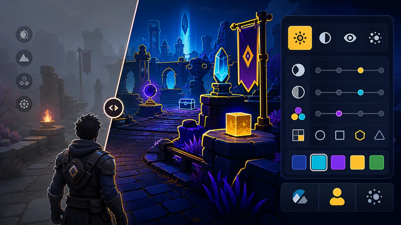
High-contrast settings make an HTML5 game easier to read when lighting, color vision, glare, or a small mobile screen hides important details. A useful mode does more than increase saturation: it separates gameplay objects by luminance, outlines interactive targets, and repeats color information with shapes or patterns.
This guide explains how to plan, implement, and test a high-contrast visual mode without replacing the game's art direction. The goal is a player-controlled setting that remains clear across menus, HUD elements, effects, and every playable scene.
Start with gameplay information
List the visual signals a player must recognize quickly: the player character, enemies, hazards, pickups, exits, aiming markers, health, cooldowns, focus states, and timed objectives. Rank them by consequence. Missing a decorative prop is acceptable; missing a damaging floor tile is not.
Review representative dark, bright, crowded, and mobile scenes. This inventory prevents a common mistake: improving menu contrast while leaving the actual game unreadable.
Use contrast as a system
A high-contrast mode should apply a consistent token set rather than one-off color changes. Define alternate colors for backgrounds, primary text, secondary text, interactive controls, danger, success, selection, and disabled states. Keep these values in a theme object or CSS custom properties so the mode can switch without reloading.
:root[data-contrast="high"] {
  --panel-bg: #050914;
  --text-main: #ffffff;
  --focus-ring: #ffd84a;
  --danger: #ff4f7b;
  --success: #42f5c8;
}
Canvas-rendered games can use the same concept through a centralized palette or material table. Avoid scattering hard-coded colors through scene scripts.
Do not rely on color alone
Two elements can remain confusing even when their colors are far apart. Add a second cue: shape, border style, icon, pattern, animation, or position. An enemy projectile might use a pointed silhouette and danger outline, while a collectible uses a circular silhouette and pulsing halo.
This approach also helps players with different forms of color-vision deficiency and keeps meaning intact on low-quality displays.
Outline important game objects
A controlled outline can separate sprites and 3D objects from busy backgrounds. Use a light outline on dark scenes and a dark outline on bright scenes, or choose automatically from the local background. Keep stroke width proportional to rendered size so it does not disappear on high-density phones.
Prioritize players, hazards, interactable objects, and objectives. Outlining every prop creates new clutter and weakens the visual hierarchy.
Make the HUD readable
Place text and icons on stable surfaces instead of directly over unpredictable gameplay. A subtle opaque panel often performs better than a heavy text shadow. Increase the separation between filled and empty health segments, and add shapes or labels to meters whose meaning otherwise depends on hue.
Touch controls need the same attention. Verify that buttons remain visible over every map and preserve safe-area spacing. The mobile checklist in How to Optimize HTML5 Games for Mobile covers sizing, orientation, and responsive placement.
Design strong focus and selection states
Keyboard and gamepad users need to know exactly which control is active. Use a high-contrast focus ring with enough spacing from the control border. Do not communicate focus through a faint color shift. Pair the ring with a small scale, underline, or marker when the interface is visually dense.
Keep focus behavior aligned with keyboard remapping settings, especially when players navigate menus without a pointer.
Control flashes and motion separately
Contrast and motion are independent preferences. A player may want stronger object separation but fewer flashes. Do not force brighter explosions, rapid pulses, or camera effects when high-contrast mode is enabled. Provide a separate option based on the techniques in Reduced-Motion Settings for HTML5 Games.
Likewise, preserve audio cues as an additional channel rather than a substitute for readable visuals. Review the approach in HTML5 Game Audio Settings for independent volume, mute, and feedback controls.
Save the preference locally
Apply the selected mode immediately, then store a small preference such as normal or high in local storage or the player's profile. Load it before the first interactive scene to avoid a bright or low-contrast flash during startup.
If your portal supports accounts, sync the preference through the same profile data used for other personal settings. Keep a local fallback for guest players and temporary network failures.
Offer a useful preview
A settings label alone cannot show the effect. Include a small preview containing text, a hazard, a collectible, a focus ring, and a background sample. Update it live when the player changes the option. Avoid auto-closing the panel so players can compare modes comfortably.
Test real scenes and devices
Automated contrast checks help with DOM-based menus, but canvas gameplay requires visual inspection. Test every map type, pause screen, tutorial overlay, end screen, and failure state. Include sunlit rooms, dim rooms, reduced display brightness, glare, and grayscale simulation.
- Verify the player, hazards, and objectives at a glance.
- Check text, icons, focus rings, and disabled controls.
- Confirm effects never hide essential targets.
- Test common phone aspect ratios and browser zoom.
- Check that the mode survives refresh, sign-in, and sign-out.
- Ask players with different visual needs to test representative levels.
Measure the impact
Track anonymous setting adoption, exits from visually dense scenes, and accessibility-related support requests. Do not treat low adoption as failure; an accessibility control can be essential for a smaller group. Use feedback to find missed scenes and confusing cues, then add those cases to regression testing.
Implementation checklist
- Inventory every critical visual signal.
- Create centralized normal and high-contrast theme tokens.
- Repeat color meanings with shape, pattern, outline, or icon.
- Keep contrast separate from motion and audio preferences.
- Preview and apply the setting immediately.
- Persist it locally and, when available, in the player profile.
- Test all gameplay scenes, HUD states, and mobile layouts.
A strong high-contrast mode preserves the game's personality while making its information hierarchy unmistakable. Build it as a complete visual system, give players control, and test where the game is hardest to read—not only where the settings menu looks clean.